KDE 4.2 Review From Inside Out. Part 1
It's probably the first time in my life when I'm writing a post with a word "Review", but looks like it's a perfect time to start doing that. Right now I desperately need to tell the world about KDE4, or to be precise, soon to be released KDE 4.2. This is going to be the first "real" release targeted not only at KDE developers and enthusiasts, but at general public - all the people who eagerly waited for the next KDE desktop to arrive. With this review I'd like to let people know that the KDE 4 is ready and to once again celebrate the hard work of all the people who put tremendous effort creating this great desktop.
Now you may think that because I'm a KDE developer, this is going to be one more "fan boy" article about KDE4, but I hope I'll prove you wrong. There are things I like, things I hate and things I miss in the new desktop and I am going to write about all those things. Of course everything that is written below is just my own opinion. Feel free to agree or disagree with me :)
Also note, that I'm going to review only the functionality and applications that I actually use. Surprisingly enough that is a fairly small subset of what KDE4 provides, so for example if you want to learn about the new KOffice you're going to need another reviewer ;) But enough of introduction, let's start.
4.2 is 4.0
There was a lot of controversy about KDE4 release schedule. There was a hard decision to ship 4.0 last year in January in the highly unstable state. I still think it was a wrong decision and we (being the open source project) could delay 4.0 for 9 months or an year. From the other side, the experimental .0 release wasn't so much a disaster. Thanks to the efforts of people from Marketing Working Group, people got the message about experimental nature of the release.
4.1 was the desktop I could start using myself and I did exactly that. Still I never recommended it to my friends (or to be more precise, I recommended against using it ;)). But the year passed by and now we're ready to release the "real 4.0" which is for the reasons described above called 4.2. So, let's see what we have now.
General Look and Feel
In comparison with KDE3, the 4.2 desktop looks modern. What's important is that it certainly doesn't copy neither Windows Vista, nor Mac OS. It has its unique identity in everything - in icons, widget theme, panel and desktop theme, window decorations, etc.
I have an impression that it's during KDE4 development artists became a team and started thinking about consistency and coherence in visual appearance. Let's take icons for example. I usually don't care much about them, unless there is an icon that stands out of line and annoys me. In KDE4 so far all icons look consistent for me.
Oxygen theme for Plasma makes the desktop feel right. Dark blue and black decorations match perfectly. Those people who install KDE4 from OpenSUSE packages should really change the desktop theme from the OpenSUSE default grayish theme (was it called Aya?) back to Oxygen. It's not that Oxygen theme looks better (that's highly subjective), it just looks "right" because all parts of the decorations fit together.
Things aren't as bright with Oxygen window decorations and widget style. The window decoration features cartoonish minimize/maximize/close buttons which give almost no feedback when you press them. But that's fairly minor issue. The major issue in the window border which is annoyingly think. I hate when decorations take my screen space. First, I don't want to see 5 pixel borders from each side, even on my 1920x1200 screen. Second, the rounded window corners are aliased and therefore look ugly and "unprofessional". In Mac OS, for example, windows have no border at all which contributes to the nice and professional look and feel.
What I'd love to see at least, is a configuration option to make window borders tiny. We had this option with Plastik in KDE3 and we have this option with other KDE4 styles (like QtCurve). I simply can't understand why the window border thickness is not configurable with Oxygen.
While the KDE4 default Oxygen widget style generally looks good, it's not without problems. It is certain and fortunate that we didn't screw up with default style like we did when KDE 3.0 was released with Keramik :) Oxygen is a good style, but there are a few things I dislike about it.
First, and most importantly, the scrollbars have an usability problem. Scrollbars are visually separated from their scrollable view. When you have two scrollable views sitting one alongside another, you'll see the scrollbar right in between them and you never can tell which view has this scrollbar - the one to the left or the one to the right. After a millisecond of thinking you remember that views usually have scrollbar on the right side and solve that problem. Remember the book "Don't make me think"? I always remember it when I see Oxygen scrollbars.
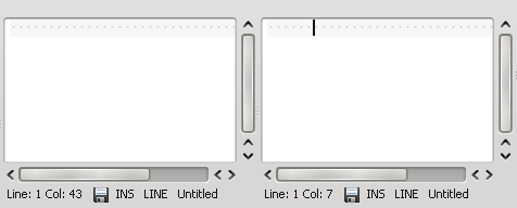
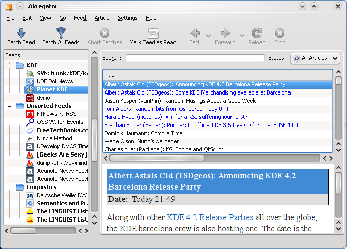
The scrollbar ownership problem combined with visually indistinguishable resize grips on splitters (just 3 subtle dots for the whole splitter) make for example Akregator unusable. Just look at the screenshot below and tell me without thinking where you'd grab to increase the height of the bottom view ;)
I haven't seen a single widget theme that has such "orphaned" scrollbars, neither or Linux nor on Mac or Windows. There are other minor issues with the style such as tabs that take too much screen estate and comboboxes that don't react visually (push down) on clicks. What I'd like to say here is that it's really unfortunate that those 3-4 problems radically impair the user experience with otherwise nice and well done Oxygen style.
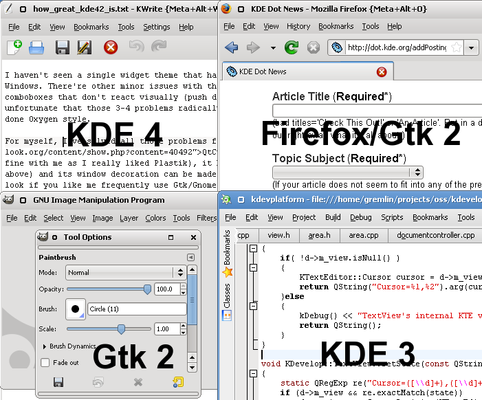
For myself, I've solved all those problems for now by using QtCurve style. QtCurve resembles Plastik from KDE3 (which is fine with me as I really liked Plastik), it has little visual glitches (at least none of the described above) and its window decoration can be made thin. As a bonus, with QtCurve you can get uniform desktop look if you like me frequently use Gtk/Gnome and KDE3 applications. I still depend on KDevelop3 and Konversation. I frequently use Gimp and I have Firefox as my primary browser. All those applications look great and consistent with QtCurve.
The last thing from the "look-n-feel" department I'd like to mention is the overall desktop performance. I don't need any numbers to tell that performance hasn't changed much from KDE3 times. On my hardware (which is Core Duo 4600 based PC) KDE3 was fast. KDE4 feels the same, after all, it's not Vista :) Certain applications (like Dolphin, Konsole or KMail) even improved their startup time.
Conclusion
If you just need one reason to switch to KDE4 - it's the look and feel. The modern polished and stylish look makes your desktop experience as pleasant as possible. None of the issues I've described above is a showstopper for the user. In the worst case you'll end up like me using non-default widget style, but that's hardly a problem.
KWin Window Manager and Desktop Effects
I can hardly say anything about KWin itself. That's the amazing piece of software that never stands on your way and this is exactly how the window manager should work in my opinion.
KWin is highly configurable and customizable. This review is too small to even list all the things you can do with your windows. But there are two advanced KWin features that I actually use.
First feature is the window geometry/position saver which is handy for those applications that don't remember those settings themselves. Some time ago Konversation used to forget its position on the screen. Now KWrite has sclerosis. With KWin I'm always able to fix that myself.
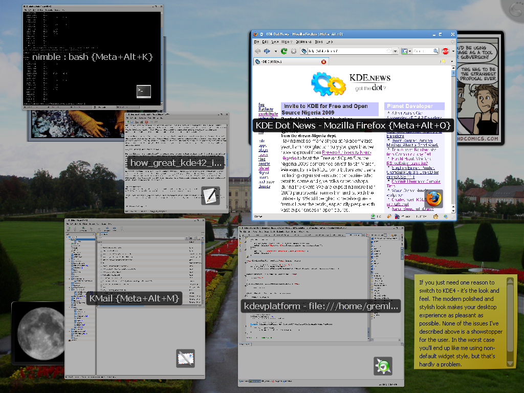
Second feature worth mentioning is window shortcuts for quick switching. If your like me always have a certain number of windows opened, you'll find this useful. For example, my session starts Konsole, KMail, KDevelop and Firefox. Normally I keep them opened 100% of the time and no matter how many other windows I open, there are always Win-Alt-K, Win-Alt-M, Win-Alt-L and Win-Alt-O shortcuts to switch to and between them. The more windows you opened - the more you like window shortcuts.
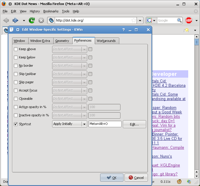
I'd advise you to give those features a swing. You'll find them in Window Menu (Alt-F3) => Advanced => Special Window Settings, Geometry and Preferences tabs.
KWin shines when it comes to the desktop effects. Compiz Fusion, the traditional solution to desktop effects is actually a compromise between appearance and window management features (and also stability as Compiz developers admit). With KWin you don't need to compromise neither stability nor features. Compositing and desktop effects come as an integral part of the window manager.
As a MacBook owner and Mac OS user I certainly like to have things like Exposé (called "Present Windows") and Desktop Grid in KDE as well. Window shadows would also be familiar for the Mac OS user. From the tons of other effects I saw the value in "mouse mark" thing. Usually you'd use mouse cursor to show off things on your screen to other people. With mouse mark you can also draw directly on the screen highlighting important areas.
Desktop Effects (aka "compositing") do require more or less modern graphics card. I used desktop effects on my Macbook Pro with ATI X1600 card and their performance was ok. On ATI 3450 there's nothing to complain about wrt effects. Other people report that integrated Intel graphics is ok. With newest drivers NVidia should work fine as well without any performance penalties for the rest of the desktop (see my previous post for the detailed discussion of problems with previous NVidia drivers).
No matter how much I like the idea of desktop effects, I still don't use them. With compositing enabled Firefox is slow as a hell at rendering and scrolling web pages. Current Webkit based browsers for Linux are not yet as good as Firefox so there's no way I'm switching from it. Firefox 3.1 beta has better performance with composite, but not much. Another known compositing problem is that with ATI proprietary driver video doesn't work (it flickers).
Conclusion
KWin is awesome. Do spend a couple of minutes and look through all its features to find some that you will like. I personally recommend window shortcuts and geometry saver.Desktop effects with KWin do not just look cool, but instead provide usable features like "Present Windows", "Desktop Grid". If you have the right graphics card/driver combination or Firefox and video problems don't happen (or don't matter) for you, enable the desktop effects.
Plasma Desktop
Plasma is the complete redesign/rewrite/rework/re...etc. of the desktop in KDE4. I've mentioned how great it looks before, now it's time to look at the functionality.
Panel
From user's point of view not much has changed since KDE 3.x in the panel. It's still the good old K-menu + app launcher icons + desktop switcher + task manager + system tray + clock thing. Works fine - no complaints.
In 4.2 panel finally has one of two important features I need, namely the "Windows Can Cover" mode which I always use. Another one is still missing though. I very much liked the MacOS-alike menubar mode in KDE3. You could place the menubar panel on the top and add menu, application launcher, systray and clock there while leaving the task manager panel at the bottom (in "Windows Can Cover" mode). Such setup saved me some precious vertical screen space. Precious because I'm an widescreen monitor addict and on my 1920x1200 display I hate anything that takes my pixels from that "1200" side.
There are two implementations of the menubar for KDE4 already. One lies in the playground and another comes with the Bespin widget style. I tried the the later which is called XBar. It mostly works, but doesn't look good even with Bespin. With other styles it's just plain ugly. I guess the code needs some more love to make the XBar ready for general consumption.
Desktop and Widgets
Plasma brings some fresh air to the Linux desktop departments. What I really like is this new and default "no f*g folder/file icons on the desktop" mode. Before KDE4, my desktop was always filled with all that garbage that I download with the web browser, files I temporarily save and so on. Because of that, the desktop had only one purpose - to be the trashcan that you need to sweep out periodically. Plasma by default won't let you do this and instead brings some value to the desktop with Widgets (aka Plasmoids).
KDE4 comes with 60-70 widgets you can place on your desktop, but after a year of using KDE4, I refined my selection to just 4 widgets.
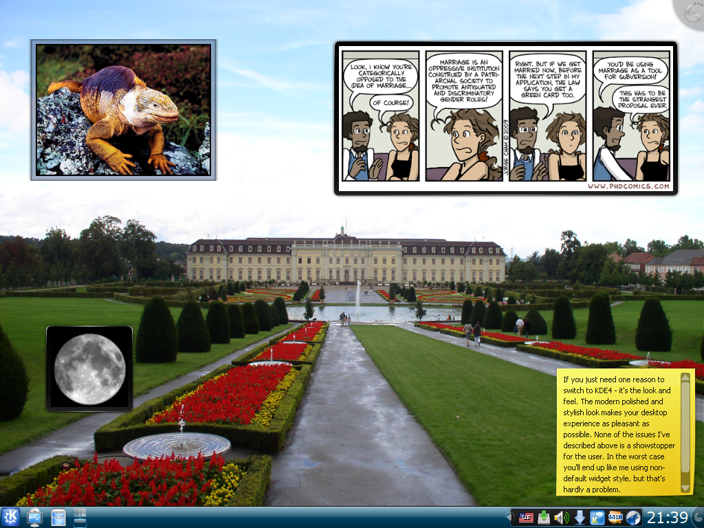
The most useful addition to the desktop is the Picture Frame. I like to put the photo of my girlfriend into the nice frame right onto the desktop without having to change the wallpaper. In general, people faces and pets don't look good as wallpapers, so with Plasma you can have them as picture frames floating over the background.
Comic Strip is the another widget I'm totally in awe of. What can be better than getting the most recent strip from PhD Comics series right after login? :) Yeah, I know, I'm a pervert and you'll most likely be following Dilbert or XKCD, but I'm sure you get the idea ;)
Having used Notes in the Mac OS dashboard, I liked them in Plasma. Desktop just feels like the right place to put some random notes and now you can do that with KDE4. The good old KNotes application from KDE3 is still there in KDE4, but I just don't need it anymore. My notes are now on the desktop.
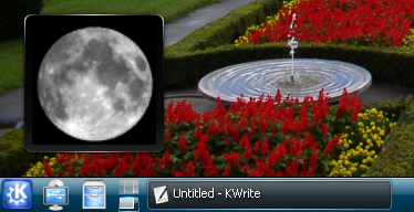
And finally, the last widget I use is called "Luna" which is a nice way to show the phase of the moon. I like to take my camera with a long lens, go out and shoot moon so it's good to know that there's a full moon day approaching. While I'm writing this review, Luna tells me that tomorrow is the full moon. How sweet :)
Here's how my desktop looks with all those widgets:
I was amazed how such a simple idea of having widgets on the desktop changes your experience for good. Also now I'm totally convinced that KDE4 implementation of this idea is the best out there. Vista's gadgets occupy only the small part of the desktop leaving you with those annoying icons for the rest of the desktop space. In Mac OS you need to go to the Dashboard for widgets. And only in KDE4 widgets are exclusively on the desktop, in fact they "are" a desktop.
Only with free software you have this power to make a decision to completely replace the old desktop with icons with the new one with widgets. Good to see both Apple and Microsoft still struggling with the old desktop metaphor while we're enjoying the new one :) And by the way, KDE is not Apple. The default desktop setup is not going to be the only one possible. Choose "Folder View" containment as a Desktop Type, and get your icons back. I do advise against that, but it's your choice after all.
When desktop becomes more useful, the old problem how to show it when it is covered by windows becomes more severe. Vista solves this in the most useless way - the Sidebar is allowed to be on top of windows, effectively reducing the screen space. MacOS's solution is to show translucent Dashboard on user request only (with F12 shortcut, with active screen corner or with dock button). In KDE4 you can also show desktop widgets in a MacOS-alike way with Ctrl-F12, but instead of that I just add an extra virtual desktop and keep it always clean without windows. Any time I need the desktop widgets - I just switch to another virtual desktop.
Widgets you place on the desktop can also be added to the panel. Plasma team spend several years redesigning and rewriting the desktop and panel from scratch and now it certainly pays off. The same clock you see on the panel can be added to the desktop and vice versa. But no rewrites comes without consequences. Many places still need polishing. For example, the "Digital Clock" widget has its own implementation of the calendar widget and unlike the standard one from KDE libs, this has some repainting glitches and bugs with popup menu rendering. Also after increasing desktop resolution with xrandr command, desktop and panel resize fine, but you can't move the widget outside of the previous desktop dimensions. Such small problems exist, but I'm sure they will get all fixed eventually during 4.3 (or even 4.2.x) development.
In general, both the desktop itself and the widgets in KDE 4.2 provide great user experience. But at the same time you shouldn't expect as much polish from 4.2.0 as you would from 3.5.10 for example.
Kickoff Menu
Looks like there can be only "love or hate" with the new KDE4 menu for most people. For most, but not for me. I don't care about the "K"-menu at all as I rarely use it. What I like in the new menu is that by default only "Favorites" tab is shown and that there's a search bar to discover installed applications. This already covers 80% of my needs. Another 20% of my needs is covered by "Recently Used" tab. I visit Applications tab only once after new distribution installation just to check what's new came with an update.
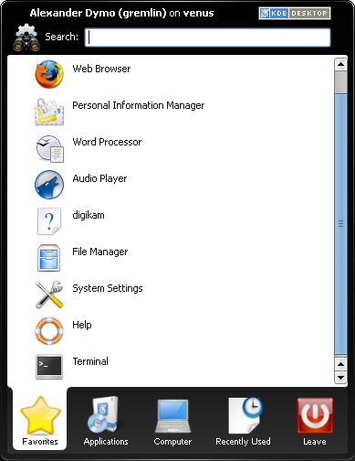
Despite its low value for me, Kickoff menu is a nice change from the traditional one. But, in case you hate the new menu, just switch it to "Classic" style and relax ;)
KRunner
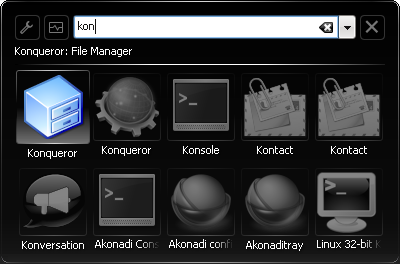
KRunner (Alt-F2) is the natural answer to the question "how to launch applications without fiddling with the menu". In KDE3 KRunner was just the tool to run command. The new KRunner in much more than just a command runner.
While you type, it will search for installed applications, commands in the PATH, bookmarks, contacts, opened devices and so on. For example, this is what you get typing "kon":
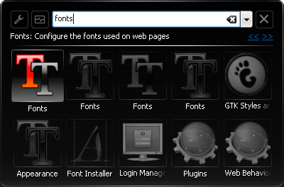
You can type whatever you want, and KRunner will ask its numerous plugins to come up with suggestions for you. For example, see what it shows after typing "fonts":
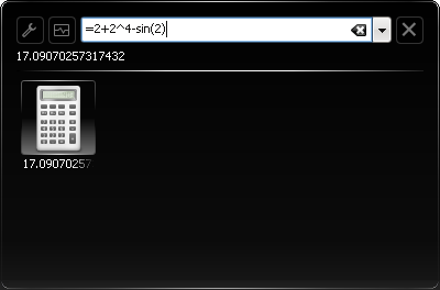
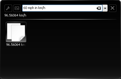
Veteran Mac OS users should have already recognized that KRunner is inspired by Quicksilver - the best application launcher for Mac OSX. Indeed, KRunner developers certainly took ideas from Quicksilver. If you turn on "Task oriented" KRunner user interface mode in the settings, then you'll even have Quicksilver-like UI. Personally, I prefer the command-oriented mode with the input box. First, it is much easier to type things there. Second, it's more convenient with a calculator plugin. Yes, right, KRunner can replace the calculator - just type your expression in the box starting with "=" and get your result:
KRunner doesn't come without problems of course. The minor problem is that sometimes it won't run the command you've typed (doesn't happen too often). The major problem is its discoverability and help.
I think that for the new KDE user it will be hard to discover KRunner itself. The only way to show it without knowing "Alt-F2" shortcut is the "Run Command" entry in the desktop popup menu. It's even harder to use plugins. Some plugins are obvious and do not require usage documentation, but plugins like calculator and unit converter do. For example, there's no description on accepted expression syntax and allowed mathematical functions for the calculator.
Unit converter is even more enigmatic. I spent half an hour trying various combinations of units to find out what it converts and how to do that right. Being a geek, I had some fun, but I wouldn't expect normal people to do that. I think we need to add some help for KRunner plugins. Having an "?" icon next to "i" in the plugin selection dialog appears to be the best place for that. And I don't think we need to write docbook documentation for that - just a window that would show essential usage information is enough.
In any case, do try KRunner. Press Alt-F2 to show it, go to configuration and enable launcher plugins you'd like to use, and spend some time exploring the features. If you used and liked Quicksilver on Mac, you'll like KRunner. If you never used this kind of application, you'll be pleasantly surprised with how useful it can be. I'd say that if you need one more reason to switch to KDE4 - it's the KRunner. It's simply awesome.
Conclusion:
Plasma makes the desktop valuable again. I liked the default uncluttered mode without any icons and I liked the idea of widgets that you can put on the desktop. Unlike 4.0 and 4.1 Plasma in 4.2 is usable and stable (not without minor glitches though).
KRunner is a killer feature. Once you try it, you'll never stop, believe me. In my opinion, KRunner may easily be one of the reasons to switch to KDE4. I only wish it was more prominent and more documented.
As a general conclusion, I should say that after KDE4 I don't want to get back to KDE3. The new Plasma desktop is a huge success and with proper architecture and implementation behind it, I'm sure we'll see even more exciting improvements in the future. And of course, I'm sure that in subsequent KDE releases we'll also see even more polished and ironed out 4.x desktop.
I hope you enjoyed this review and I hope I've shown enough to convince that KDE 4.2 is the desktop worth using. It's stable, it looks perfect, it has some killer features like new desktop with widgets, KRunner and window manager with desktop effects built in. No review can cover all goodness that comes with 4.2. Discover it yourself!
Even without all the things that come with KDE4 I would have enjoyed using it. But the real power of KDE lies not only in the desktop. The remaining part is the outstanding set of applications that is shipped with KDE. So, please come back soon for the next part of this review where I'll describe the programs for KDE4 that I enjoy using every day.
| Next: | KDE 4.2 Review From Inside Out. Part 2: Applications |
| Previous: | KDE4 Performance on NVidia 8600GT: Problem Solved by Bying ATI |